
Wednesday, 30 September 2015
Library visit
Today in tutorial we went to visit the library and learnt how to use all three of the printers and which one does colour and which one does black and white. We then also got told about taking books,films and magazines out, we learnt that you can borrow up to 8 items per time and have to either bring them back or renew them within the two weeks of getting them. We then learnt how to use the printer, you have to swip your card, the black line on your card has to be facing the scanner, then something will appear that tells you what you have sent to the printer and then you click print and it will print out your work. We then had to look around and find a book that interests me and that I would like to read, this is the book I chose...
Label Design
Today in the second session with Owain, we had to create a label for our product we are going to advertise. The label had to look as realist as it could, after looking at different fonts we had to chose one to be our main title on the label. We then had to find all the basis things that go on a label for example - barcode, nutritional information, sell by date and then we had to pick a slogan. I looked for loads of different ones and didn't like any of them so I came up with 'there's only one Pineapple twister' which I thought was quite catchy. I then got a picture of a mask to represent the freaky side of the drink when we do the filming for the advert. I also put the price on there too.
This was my final label that I produced via Photoshop.

This was my final label that I produced via Photoshop.

10 Freaky Images


 My first image that I have taken is of an eye with teeth as
the pupil, I picked this image because I think that it looks very freaky and
also it’s unique, it’s very doable too. I could recreate this image by taking a
picture of somebodies eye and then of their teeth and merge those together
making it look like the original image.
My first image that I have taken is of an eye with teeth as
the pupil, I picked this image because I think that it looks very freaky and
also it’s unique, it’s very doable too. I could recreate this image by taking a
picture of somebodies eye and then of their teeth and merge those together
making it look like the original image.
The second image I chose as it’s very freaky and with some
difficultly you may be able to recreate it! By using either photo shop or
actual makeup to make somebody you know look identical to this image.
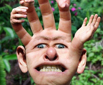
The third image I really do like as it’s simple but still
freaky and unique. It’s of a hand with a face and ears and on the fingertips
there is more hands added, this would be very fun to try and recreate. I would
like to take this one further and try to recreate this.
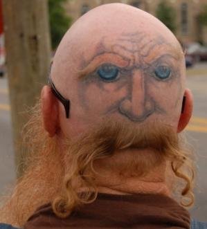
My fourth image isn’t very freaky but it’s unique, it’s of
somebodies head from the back with a tattoo or drawing onto the back of their
head and then removing somebodies hair but keeping some bits to create the
beard for the image.
The firth one is very easy and simple, by taking a photo of
somebodies face and then again by using either photo shop or personal make up
you could do this onto somebodies face, I like this image as it’s unique.
My sixth image is pretty cool as it’s of a foot that looks
like it has a heel but in the same colour and form as the foot, I like this as
it is very unique and with some try you could recreate this image.
My seventh image is of somebodies back with a tail added on,
I like this as it’s unique and different. I think that would be easy to
recreate as it’s simple and not too edited.
My eighth image is very scary and freaky, this could also be
recreated with makeup. I really do like this image and would like to recreate
this if I had more time to do more than one.
Different fonts
Today in our first session with Owain, we looked at making a label for our product we are advertising with our group. Owain shown us a website with loads of different fonts on to use as our main title of our product, we had to put all the different fonts we found onto Photoshop and by Print screening the page and then cropping until you get just the word that was in the font. Me and my group haven't came up with a name yet so I just used 'Kola Zero'. I found loads of scary, freaky fonts that I can now chose from. Afterwards Owain personally shown me how to change the colour of the font by going on the layer of one font, then using the magic tool, clicking the white background and then clicking back space to delete the white background, then double click on the layer on the side and a box will appear, then you click on 'Colour overlay' and then choose a colour and one of the fonts will change colour. Here is a picture of my examples of the fonts I found and chose.
I like these fonts because I feel like they will stand out and mix in with part of our theme, my favourite one out of all of these fonts is the second one as I feel like it's not got too much effect on but it fits in with what our advert will be based around.

I like these fonts because I feel like they will stand out and mix in with part of our theme, my favourite one out of all of these fonts is the second one as I feel like it's not got too much effect on but it fits in with what our advert will be based around.

Monday, 28 September 2015
Subversive adverting
In a lesson with Faye when I was away, they spoke about different sub verses advertisements, they had to research different sort of adverts and then make a poster or some sort of advertisement to help people see that some companies use or advertise in the wrong sort of way. For example- Apple uses children to sell their products, Here is something that I got off the internet whilst I was doing my research on different sort of companies.
 so I made this poster/logo to give people my awareness -

 so I made this poster/logo to give people my awareness -
I made this logo to make people aware of what Apple are trying to do and how they are selling their products which some people don't know about.
Advert Idea
In the second session with Faye, we stayed with our groups and we had to start planning our advert ideas, to start with.. we looked at a some different adverts to give us an idea of what we could do or provide in our advert. After we got a rough idea we had a talk about who would be doing which main part, we decided that Amber would be the editor and edit all our clips and make the clips a lot more darker and spookier, we decided that I would be the director/filmier, so I would be the one telling people were to stand/start and film the whole advert, we then decided that Nathan would be the actor and play the main part in the advert. Me and Amber did offer to play a part if need be. We then had to come up with a location, we tried to think of spaces that are close by but can be put into a freaky way, so we came up with the spinal staircase, we thought this because when it's edited it would look spooky. The props we will need for this advert are either face painting or a spooky mask or maybe an old Halloween costume. After getting all the main things sorted we then had to decide what was going to happen in the actual advert. We then again looked around and found a few adverts and decided that it would be good fun to try and recreate the 'snicker changing room' advert but using a different product. In this advert, somebody is a girl and is being really moody and then a friend gives him a snicker to calm down and he turns back into his original self, whereas in ours it's going to be a little different. In our advert, we are going to have somebody being a very scary monster that is chasing somebody up a staircase but then the person that is being chased then says, 'here have some of this to calm you down' so the scary person will then drink the drink and then he will form back into a normal human being. Hopefully when Nathan comes back he will helps us develop this idea and add a few extra key parts that will help us accomplish this advert.
This is an image of the snicker advert that gaves us this idea:

This is an image of the snicker advert that gaves us this idea:
Adverts
Today in the first session with Faye we got put into our filming and production groups to make an advert together, I got put with Amber and Nathan. We got given some questions to answer to get to know the other people in the group and what they enjoy doing most and what their strong points are.
I found out that Amber doesn't like being in front of the camera but she more likes to edit the videos and photos after filming, she doesn't mind filming but feels like her strongest and most favourite point is editing. Nathan wasn't in today so I couldn't ask him the same questions.
After that we had to research for freaky adverts online, me and amber found these three freaky adverts.
Three freaky advert links-
The first advert we found was adverting for snickers,
The link is posted below.
https://www.youtube.com/watch?v=JgSv1SKCteQ
 The first advert I found was an advert about snickers. I found this advert really freaky mainly because of the actors that are in the scenes. The movement of the camera makes the advert seem a bit more scary, also the women's facial expressions in the advert makes the advert seem a lot more scary and terrifying.
https://www.youtube.com/watch?v=XptM1LCX7r4

The second advert that I found was about the phone company Giff Gaff. I liked this advert, it was my favourite one out of the three as I think this one was the most scariest/freakiest out of them all. I found this advert really freaky because of the way it was filmed and the effects used during the advert. The background sound made it a lot weary and makes you want to watch it to see what happens next. Also the costumes that were used made it a lot more freakier.
https://www.youtube.com/watch?v=N2oL_gXECtg

The final advert I found was adverting Phones4u, this one was also my favourite as it has most of the same effects as the Giff gaff one. The background sound made this advert a lot more freakier and the effects they used on some of the actors made it so much better! I liked the fact how there were some pop ups but they weren't scary enough to make you jump. The actors were really good in this advert and the facial expressions were really good too.
After we found our three main adverts we did some more researched and also found some more freaky adverts -
https://www.youtube.com/watch?v=R8Xgi63j-FA
This advert was about McDonald. I didn't quite like this advert as it had nothing to do with what it was advertising but I did like the effects used. I liked how the scenes changed and the background noise blended in and made the advert a lot better! I didn't expect it to advertise what it did advertise.

I found out that Amber doesn't like being in front of the camera but she more likes to edit the videos and photos after filming, she doesn't mind filming but feels like her strongest and most favourite point is editing. Nathan wasn't in today so I couldn't ask him the same questions.
After that we had to research for freaky adverts online, me and amber found these three freaky adverts.
Three freaky advert links-
The first advert we found was adverting for snickers,
The link is posted below.
https://www.youtube.com/watch?v=JgSv1SKCteQ
The first advert I found was an advert about snickers. I found this advert really freaky mainly because of the actors that are in the scenes. The movement of the camera makes the advert seem a bit more scary, also the women's facial expressions in the advert makes the advert seem a lot more scary and terrifying.https://www.youtube.com/watch?v=XptM1LCX7r4
The second advert that I found was about the phone company Giff Gaff. I liked this advert, it was my favourite one out of the three as I think this one was the most scariest/freakiest out of them all. I found this advert really freaky because of the way it was filmed and the effects used during the advert. The background sound made it a lot weary and makes you want to watch it to see what happens next. Also the costumes that were used made it a lot more freakier.
https://www.youtube.com/watch?v=N2oL_gXECtg
The final advert I found was adverting Phones4u, this one was also my favourite as it has most of the same effects as the Giff gaff one. The background sound made this advert a lot more freakier and the effects they used on some of the actors made it so much better! I liked the fact how there were some pop ups but they weren't scary enough to make you jump. The actors were really good in this advert and the facial expressions were really good too.
After we found our three main adverts we did some more researched and also found some more freaky adverts -
https://www.youtube.com/watch?v=R8Xgi63j-FA
This advert was about McDonald. I didn't quite like this advert as it had nothing to do with what it was advertising but I did like the effects used. I liked how the scenes changed and the background noise blended in and made the advert a lot better! I didn't expect it to advertise what it did advertise.

Friday, 25 September 2015
Composition and framing

- Rule of thirds
- Leading lines
- Symmetry and pattern
- Viewpoint
- Background (out of focus and deep)
- Framing
- Cropping
 Here are some of the images that I found.
The first image was background, as was a nice example of backgrounds. The second image was framing because it has a circle in the middle of the page which is different to the rest of the background. The third image was Rule of thirds, this is because the doll is on the left hand side of the page. Finally the fourth image is view point because it's somebody looking down and you can see the nice view.


Wednesday, 23 September 2015
Simple banner poster
Today in our second session with Owain we had to make a simple banner poster by using the software Photoshop. To start of with we had to get a simple rectangle by using the shape tool, after did got a simple rectangle on my page, we then had too by using the 'pen tool' and selecting 'add Anchor' we had to click onto the middle of the side of the rectangle. Holding shift I then had to do the same on the opposite side.
After that I had to hold down shift again and I had to make a simple square on a different layer. I then have too use the 'direct selection tool' and selected the bottom right corner on the square which then I had too click backspace and this deleted half of the square leaving me with a very skinny square. I then had too double click on the layer with the triangle and a box with different options, I then had to select the 'Gradient overlay option' whilst on there I had to change the angle from 90 to -90 and then had to change the scale from 100 to 150.
Once I had done that, I then had to go onto Edit, transform and click flip horizontal, this flips the shapes the other way round. I then had to make a new layer but this time adding a text box onto of my rectangle. I could type any word into my text box, so I typed 'Unique'. Once that was done, I had to hold down 'Shift' and select all my shapes that I had made previously and click this button below called 'Link button' and then add another layer underneath all of your previous layers. Using the 'paint bucket' I had to make the background a different colour. Clicking on my layer with the different coloured background it then brought up the 'gradient overlay' again where I had to then change the background into gradient or any other sort of background of my choice. I could also go onto 'adjustments' > posterize and this gave me other options of backgrounds to choose from. After I did that, I made a new layer and added a picture of my choice, again using the 'freedom pen tool' I drew around the image, then by right clicking and adding make selection and click ok. afterwards, go onto select and inverse and then click backspace and this took away the background from my image.
I then put this on my banner and this was my final simple banner poster.

Ghostly images - Owaine
 Today in lesson we went on Photoshop and we learnt how to crop an image by using the freedom pen tool which crops things out around the image deleting the background to make the image the only thing you can see.
 To delete the background you right click an image, click make selection and then click ok. After that you go on select and inverse and click the backspace and your background will disappear.
You then copy your layer with your image on by right clicking the layer and click Duplicate Layer and it will copy your layer.
After you have done that you then work on your copied layer and you go onto Image - Adjustments - Desatuate and this will make your image black whilst keeping your background in colour.
And the final thing is on the right side of the page there is a button saying opacity - click on that and go to around 50% and this will blur your image.

Tuesday, 22 September 2015
Filming and editing - Marissa
Today in lesson with Marissa we had another basis lesson on how to use the cameras and put them together correctly, once we did that we got introduced to more simple techniques for example - panning which means you move left to right and right to left so you will video somebody walking and you would follow them. Another one we learnt was tilt, for this somebody had to stand in front of the camera and the other person had to move from the head to the toe and then from the toe to the head and finally moving paint shot this is where the camera stays still and someone or something moves in front of the camera. we then had to upload our clips onto Adore Primiere CS6 where we are going to learn how to cut our clips.
Friday, 18 September 2015
Photography introduction
Today in our lesson, we got introduced to how to use a camera and the basic ways to take a shot. We all got put into groups and got given a task, Mark gave us two books and we had to go out in groups and retake images that were inside the book and try and get them as accurate as possible. Once we did that our group got back together and showed our images and the other groups had to try and find which one we were trying to copy. After we did that we were speaking and had to draw some simple drawings of camera and had gave examples of what all the buttons on a camera was used for an labeled our drawings to help us understand how to use them a lot easier.
Here are the photographs we taken to try and retake:


Here are the photographs we taken to try and retake:
Four unique images


Photoshop Tester


Monday, 14 September 2015
Common Slogans
Today in lesson we started off learning about common slogans and what they actually mean for the brand it self. We had a list of well known slangs and had to try and thing of the brands before sharing our ideas with the class and seeing which were right.
After we got put into groups and got given a task to do with the people we were with. The task entailed picking three pieces of paper and they had different audience on them, different places were you would see advertisements and the other was the item that we had to advertise. My group picked out at random - shampoo for the elderly advertised on a bus stop. We had to come up a slogan and a catchy name for our product. We called our shampoo "silver fox" which had the advantage of being a big unique bottle filled with fanstasic smelling shampoo that makes the older generations hair a lot more thicker and full of life. This shampoo was also to help people take the friz out of their hair, therefore we made our catchy slogan "get rid of that frizzy hair and show that you care". We got given 30 minutes to complete this task before presenting it to the whole class.
If I was to do this task again, I would use my time a lot more wiser and I would write down more ideas as then it would help the group come out with a lot more ideas!
Subscribe to:
Comments (Atom)