Friday, 16 October 2015

Photography memory check

1)      What is ISO and what does it effect?
ISO controls the detail that is contained in the photograph

2)      When would we use the ‘P’ control setting on the camera mode dial?
P stands for program, the camera selects the settings for shooting a certain scene/object such as the aperture and the shutter speed.

3)      Name two important considerations when attaching the tripod base-plate to the bottom of the camera?
It is screwed on properly and the arrows have to point towards the lens.

4)      Name three important considerations when using a red-head lighting kit?
Let it cool down before packing it away and make sure that you do not touch the barn doors with your hands as it could burn you, also don’t touch the bulb as it will break easily.

5)      When focusing the camera, what do we place on the object/subject to ensure it is the centre of focus?
A green rectangle/square

6)      Name two techniques we can use to adjust the brightness and contrast of the photograph?
Aperture, shutter speed and ISO.

Tuesday, 13 October 2015

Video Evaluation

On our first session with Marissa we learnt the basics on how to use a camera and tripod and how to put them up and take them down correctly, after we all got the cameras up we then watched some clips on some techniques that you can use whilst filming, some of these techniques we used are called:
  • panning - with this, you move the camera from left to right and then right to left, so for example you will film somebody walking in front of the camera and you follow them.
  • tilting - this is going from the top down and from down to up, for example somebody standing in front of the camera and the person on the camera will move the camera from their head to their feet then from their feet back up to their head.
  • moving paint - this is where you stay still and film something walking in front of you, for example if somebody is out walking, you would keep the camera still and somebody will walk in front of the camera, coming into the shot and back out of the shot without you moving.
In a lesson with Faye, she put us into groups of three.. I got put with Amber and Nathan. Nathan wasn't here on this day so it was just me and Amber, these groups were the people we were going to make our advert with. To start of with we had to ask questions about each other so that it wasn't awkward whilst we were working together, we then had to ask each other which part of the videoing do they enjoy the most for example do they enjoy.. filming the most, or if they enjoyed editing or directing, Amber said that her favourite part was editing the clips after they had been filmed. Once we got to know each other a bit more we then had to draw a spider diagram and plan what we wanted our adverts to be based on.

This was our spider diagram:


As you can see, because Amber enjoyed editing the clips, she got the role of editing the advert once we had filmed it and it had been put together into a sort of advert, I decided that I really enjoyed the filming and directing people on what was next to do and keeping the filming going. As Nathan wasn't here we put him down as the actor. On the diagram we then had to come up with what we was going to advertise, me and Amber did some research on what we could base our advert on and after looking at the advert advertising 'Snickers' we decided we were going to advertise a sort of drink, To add a freaky side to the advert our advert was going to be based on the spinal staircase and it was intended to be a freaky person (Nathan in a mask) and then he has a drink of our product and it would turn him back into his usual self, which I thought was a good idea.

We then had to come up with some story boards on how our advert was going to go and what shots we were going to be using whilst filming our advert, this was our story board and our shots,


Once we did our story board, we then together had to go and check our location where the advert was going to be taken and make sure that their was no constant sound and not a very busy place so that when we go to film we won't be getting distracted by anybody half way through. This is the sheet that we had to fill out and the questions and things we had to check up:


We then did another spider diagram with more information on it saying what our age audience was and what our advert was going to have in and what it wasn't going to have in. This was the diagram that we did for that:


Once all of this was done we then had to fill in a health and safety sheet that basically said what we weren't allowed to do when we were out with the cameras and where we wasn't allowed to take them etc, after we all signed the sheet we were all set and ready to go and start filming,,
On the way to our location Nathan decided he didn't want to be the main actor in our advert so I took that role and he took the role of filming and directing the whole advert himself. We did loads of short clips of the same scene 3 times to make sure that we had enough footage to play around with when putting our clips together to make an advert, we took all our clips throughout the day and came back into lesson within enough time to then save the footage to our hard drives ready to start editing.

It became to Tuesday and we began to start editing our clips and at first we had to come up with all our footage and clips and make a 'skeleton edit' which is basically putting all of our clips together and coming up with a simple advert that we could take forward and edit afterwards. We made our skeleton edit' and was ready to start editing some of our clips so on the board Marissa began to show us some editing techniques that we could use in our advert, here are some that she shown us -

  •  For black and white, we had to click on 'video effects' and then type in 'tint' and black and white will automatically appear, you then drag and drop it onto the clip and it would make the clip, black and white.
  • Fast forward/Slow motion - click on clip, and then go down to speed/duration and then click reverse speed this will make your clip go backwards or go slow motion, you could also use it to speed the clip up that you have selected.
  • Then by pressing return, all of your editing will tender.
After using these techniques and editing our advert so it works perfectly, we finally finished our advert.

Monday, 12 October 2015

Print/Magazine advert evaluation

To start of with my magazine advert, we had to bring in 6-10 items that we wanted to take photos of using the 'red heads' which are the camera lights and using a backdrop which is basically getting a table against a wall and pinning some white paper onto the wall but making it into a sort of curve to then use as your background to place your props on that we had to bring in to take photographs off.

The main things we had to use were:

  • A table
  • Paper
  • Tripod
  • Camera
  • Red heads
I brought loads of props to take photos of and they were all related in some way to my advert that I had in mind, the props I brought in were:
  • A horse shoe
  • A horse bit
  • A model horse
  • Hoof oil
  • Different sort of rosettes
 Here are the photographs that I took of my props that I brought in.

 After we took photographs of our props we then had to edit then using Photoshop using a new technique that we got taught called 'curves' this changes the highlights and shadows on the original photographs which makes your images look a lot better and helps them stand out a lot more, there is another way that you can do this, by going onto the one below called 'levels' this does the same thing as curves. I used both of these on my photographs but then I also used another technique which is on 'curves' which I will show you below.

 This is what comes up when you go onto 'curves' onto Photoshop but then by going onto this, there are three little paint brushes that are below the grid, if you click on the one that is pure white and then click on your background this makes your background go pure white. I did this too all of my original images to make them look a lot better before then deciding which ones I was going to use for my advert.

Here are my edited photographs -

After we edited them, we then had to choose which ones we were going to use to start advertising, after a while of thinking I felt like my strongest photographs were the hoof oil and the photo of the model horse, so I took these two photographs and decided to take these two further and advertise something to do with their hoof oil, I wanted to still make it look freaky but mostly unique so I came up with the idea of Halloween hoof oil for horses. That is when I started my magazine advert on Photoshop. 

To start of with I had to try and find a freaky background as that was going to be the main thing that shows that it's going to be Halloween themed, after I found one, I then had to cut out the photograph of the horse that I took an photograph of so that the background was gone and all that was there was the horse, I did this by using the 'pen tool' after cutting out my horse I then made it black and white by clicking on 'Image' and then 'Adjustments' and clicking 'desatuate' this makes the photograph turn back and white, I then wanted the horse to look ghostly, this way it looks more freaky, so I changed the opacity, from 100% down to 43% which made the horse very faded out. Afterwards I then had to do the same with my photography of the hoof oil but I kept the opacity 100% as this was the main product that I was advertising. After that was done, I then had to research sparkly horse feet to then cut out and put on top of my photograph of the horse to make it look like I have used the product on the horse, by doing this I again used the 'pen tool' again. I put these on top of the horse but kept the opacity 100% so that they stood out a lot more.

Afterwards, the most important part, I had to come up with a name for my product and a slogan, after a while of trying to figure out a good one, I came up with the name 'Glitter hooves' and the slogan 'for super hooves' as I found this very catchy and thought that it matched.

This is my final advert:

If I was to do this again, I would firstly plan a lot more than I did this time so when I come to start my advert I know what I am doing and can get on with it. I would also plan ahead so that when it comes to bringing things in then I will know what to bring in and what I am doing the advert on before bringing things in so I bring the right things in.
I really enjoyed doing this project as it was something based on my hobby as well as something I enjoyed.

Sound and Advertising


I wasn't here for this lesson so Leah, took some photos of the work she did on the day that this work was set out and these are the ones she sent me.

Car Advert - This advert contains both digetic and non-digetic sound. The digetic sound works well as it gives a more realistic feel to the advert. As the advert is quite funny, the music is upbeath and is in mainly major keys to make the advert seem more happy and persuasive. The non-digetic sound also works well as it brings to audience back into reality and reminds them that they're watching an advert.

https://www.youtube.com/watch?v=7lcc62nrl9Y


Make up Advert - This advert contains speaking the whole way through so this would be non-digetic sound, but the background music makes you feel alive and happy, it is very funky and fits in with the advert really well. It isn't too much that you forget the advert it is a good background song.

https://www.youtube.com/watch?v=V6x6wi2hYto

Sofa Advert - Again, this advert contains speaking so this would be non-digetic as somebody is speaking the whole way through but the background music again is really funky and is well put together with the advert, I like this advert as the whole thing makes you feel happy and it is really catchy and you want to watch the advert instead of doing something else whilst adverts are on.

https://www.youtube.com/watch?v=b8ryvlAXlS0

Friday, 9 October 2015

Photography propsal

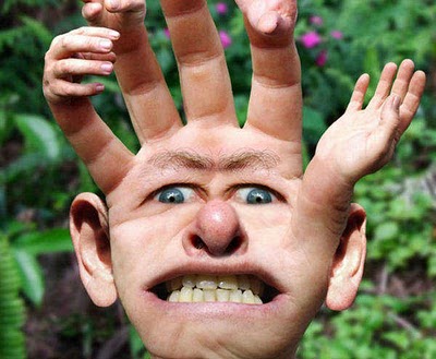
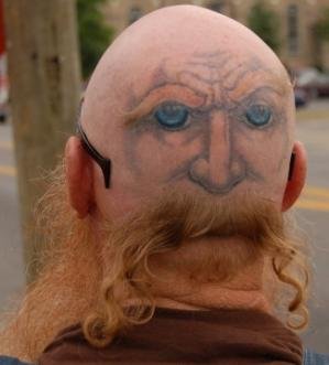
After I did my research on freak or unique images I then decided that I was going to do my advert based on Halloween type glittery hoof oil. I decided this as I thought it would be good to do something that is a hobby of mine. I thought that it was really unique and in some sort of way I am going to try and make it a little freaky.

When we took our photographs last week, I took images of:

  • some of my rosettes
  • hoof oil
  • a model horse
  • a horse bit
  • a horse shoe
When we was taking our photography, the equipment we used was:
  • a table
  • red heads (camera lights)
  • white paper for the background
  • pins to keep the background in place
  • tripod
  • camera
  • props to take photographs of
Me and a few others took our photographs in the room next door which is E101B as it had more space for us to set everything up. When I am editing my images I am going to use quite a few techniques on Photoshop, when trying to make my photographs look a lot more appealing and lighter I am going to be using the 'levels' tool, this helps bright the image to light. Another way of making the image brighten up is the technique 'curves' this works a lot like levels but this helps balance it out, if you look below once you are on 'curves' there's a little paint brush that is white, if you click on that then click on the background of your photography this would help the background go pure white and your image will stand out a lot more.

The problem with using new techniques on Photoshop on your photography is that you may come across some obstacles for example, using too many techniques on one image that it will make your image not as effective, also when you use new techniques on Photoshop you may make your image too bright or too dark but this will only make your experience on Photoshop better as you learn from mistakes. 

After taking all my images and editing them all, I decided that I was going to use the photograph of the hoof oil and also of the model horse as I thought that these had more to do with each other than all the other little bits did. I am expecting to be spending 15-20 minutes setting everything up to take your photographs on, getting everything ready and perfect for when you shoot and then I am expecting to be shooting my props for 20-30 minutes, within this time I am expecting to get a few different shots of the same prop but with different lightening and in different positions.


My idea of my advert was going to be having a freaky background then with me cropping out my photo of the horse I had taken and then changing the opacity to make the horse look sort of like a ghost. I would then cut around the photo of the hoof oil that I had taken and keep the opacity at 100% so that that main product that I am trying to advertise stands out a lot more. I will then have to come up with a name for my product and after going through loads of different ones I came up with the name 'Glitter hooves' and the slogan 'for super hooves' as I found it catchy and that will blend in well with the title. I am going to make the title stand out too.
On my photo of the hoof oil that I took a photo off, I am going to take the name of that and put the name of my product over that or where the name of the original logo went, this way it will look even more like the product was called that already. On the original product also, there is a label that says 'blond' so again also using an image of google, I am going to try and overlap this with some glitter some it looks like it says that it's glitter on the bottle.

As my background i'm going to have to be using a image from google as I won't be able to go out and take a background as freaky as I am thinking of. but everything else in the image will be purely my photography! I hope my advert works out as I think that this would be a really interesting thing to try and make an advert about. I am going to try and aim my advert obviously to equestrians for them to use at Halloween for their horses to join in with the occasion and look part of the season.

I will upload what my advert will finally look like once it has been main and I hope it reaches everything it says on here, I am going to try and achieve all my goals that I have wrote on here and hope that my advert all blends in well and works out correctly.

Memory check

Firstly in our first session with Mark we did a memory check to see what we could remember from the previous lessons.

Q1. Would we use a large or a small aperture to achieve a shallow depth of field?
Large.
Q2. When would we use the 'S' control setting one the camera mode dial?
To slow down or speed up the shutter speed.
Q3. What do we do to make a camera achieve focus?
Press down the shutter button lightly before then pressing the rest of the way down.
Q4. Name three items needed when producing a seamless background lighting set-up.
White background (paper) Lights (red heads) and a table.
Q5. When focusing the camera, what do we place on the object/subject to ensure it is the center of focus? 
A little green rectangle.
Q6. What must we do when we finish using the light to ensure it doesn't get broken?
Turn them off and leave them too cool down.

Wednesday, 7 October 2015

Creating an magazine advert

Today in lesson we have started to design our magazine advert via Photoshop with the images we took of the props we brought in on Friday for Marks lesson. My idea of my advert was adverting glittery hoof oil as like a Halloween sort of theme, so on my advert I wanted a freaky/spooky background with my photography of the horse ghosted out, I then wanted the title and the main product to stand out so you can see what is being advertised. To start of by cropping out my photography of the horse I had taken using the 'freedom pen tool' I cut around the shape and then by right clicking and clicking 'make selection' and then going onto 'select' and then 'inverse' this cropped everything out but the horse itself. I then went onto google and found a really freaky background for my horse to be placed onto. Once I did that, I looked for some sparkly hooves on google, to place on top of my photography of the horse so it looks like the horse has got the product on. By doing this I had to copy and paste separate horse feet and again using the 'freedom pen tool' going round each individual foot and placing it on top of the real horses foot. After I did this, again in Marks lesson on Friday I took a photo of some normal hoof oil from home to then edit into my product, I got that photo up and again using a tool but this time using the normal 'pen tool' I cut around my hoof oil to give it a clean finish. This was one of the things I didn't change the opacity too. After getting that into the correct place I then decided to come up the the title, with a bit of help I came up with the name 'Glittery Hooves' and also a slogan 'For super hooves' as I found this very catchy and it sounded good. Once that was done, I then got some more images of sparkly hooves and again using the same tool 'freedom tool' I then cut out two individual hooves and placed them on top of my product to go over my original logo.

What was successful in my design?  
I feel that with what I had accomplished it all went really well and went together okay. I really liked the background and how I changed the opacity for the horse to make it not stand out and to make the actual product stand out. 
What would I improve on?
I feel like I could of improved in the amount of the magazine as there isn't much on their and it's sort of all about, not put into place as well as it should.

First we drew a rough copy of what we wanted our advert to look like, this is what I drew:


Here are two of the images that I had taken in Marks lesson on Friday that I used in my advert today:


Finally here is my magazine advert that I made via Photoshop.

Tuesday, 6 October 2015

Filming - Marissa

Today in lesson we went out in our groups to start filming for our advert, we based our advert at the spinal staircase on the same floor as Media. Me, Amber and Nathan had a discussion and decided that I was going to be the one that was the main actor in our advert, we took all the audios for our advert in the same area. our advert starts of with me walking up the stairs wearing the freaky mask, then opening a door for then Amber to pass me the product that we are advertising. I then look a bit confused that Amber passed me the drink and then shown the product to the camera, I then pretended to have a drink of the product and then the next clip shown me going back to normal and drinking the drink without the mask on back to my usual self. Our last shot was of a extreme close up of the product itself so people can tell that it's the drink that we are advertising. If I was to do this again, I would plan a lot more information before going out so then we know what we are doing 100% instead of doing it as we go, I would also communicate a lot more and ask others in the group for their opinions and their ideas to get them more involved.

After we got all of our footage, Marissa then shown us as a group how to edit our footage and cut out parts of each clip that we didn't want to use. This helped us loads with our advert as there was some seconds of some clips that wasn't in focus. Next week we are going to be learning how to edit the footage a lot more, how to put sound on the advert and how to make them black and white etc..

Monday, 5 October 2015

Proposal of advert

For the advert we are going to be making, we are aiming to sell a soft drink. We are trying to achieve capturing the audience of 12+.
Our main idea is to use 2 actors, this will include Nathan starring as the main actor in the advert and then either me or Amber being the second actor who is going to be in the advert at the end for 5-10 seconds. Our idea for the audience is going to be Nathan starting of dressed up in some kind of costume/wearing a mask looking odd/freaky walking up the stairway expressing an miserable genre for around 10 seconds. Then afterwards the idea would be for the next 10 seconds he will reach the top of the stairs and be worn out/miserable and then me or Amber will appear in the shot and give him the product we are trying to sell. Once Nathan drinks this he will then change out of the props and go back to looking normal and looking a lot happier than before. Nathan will then walk on looking happy with his drink. We tried using Coca-Cola's motto open happiness. The point of this advert is we are trying to show before having the product he is a really freaky person but once having the product changes moods and goes back to being himself. We are going to be showing the product halfway through the advert and then a big shot of it at the end.

We are going to be using either a freaky or sad based background song for the meanwhile Nathan is looking miserable and then once having the product the background will change to much more of a lively based song.

We could use black and white for more effect for the freaky based advert whilst Nathan is 'not himself' / in use of the props but we have not discussed it as a group so I have no idea what effects we are going to be using in the advert.

Here is an image of where our advert may be based -

Displaying IMG_6982.JPG

Friday, 2 October 2015

Editing Photography

In our lesson today with Mark we learnt how to change mainly the background from a dull colour to white, we also learnt how to properly change the brightness without using the 'brightness/contract' instead it's better to use 'levels. something will appear and you have two arrows on either side, you need to move them to where your image information starts. you then have a middle arrow and this controls the background and helps it to go white.
We then learnt how to use the tool 'curves' again you move both the arrows until you are at your image information. Below that information, there is a black mark next to a grey and a white one, if you click on the white one and then click on your background this will allow your background to go pure white.
If I was to do this again, I would take a lot more images to then edit to make them look better/ more in focus.

These are my edited images. I have done before and after for some of my images..


Photography - Mark Epton

Today in lesson with Mark, we started off doing a quiz to see if the group remembers things we did last lesson, some of the questions in the quiz was images and we had to say what sort of image it was, also then, one was what does ASPM mean? A - aperture S - shutter speed P - program M - manual. We then looked at different images of other people doing a backdrop which is what we will be doing and using today during the lesson. We all went over to the other side of the room and Mark shown us how to use the camera lights and how to set the backdrop up properly, he then used somebodies item that they brought in and took an item to show the effects. We then got into groups and had to take some photographs ourselves of the things we brought in from home, using the 'red heads' which is the camera lights and a tripod and a camera and also a backdrop we took some simple images of our items.

These are some of my items that I took via the camera using the 'red heads' -


My favourite image out of these is the first one as I feel like it's got the most detail and the lighting in the image shines of the item, the shadow in the background makes it look a lot more effective.

Wednesday, 30 September 2015

Library visit

Today in tutorial we went to visit the library and learnt how to use all three of the printers and which one does colour and which one does black and white. We then also got told about taking books,films and magazines out, we learnt that you can borrow up to 8 items per time and have to either bring them back or renew them within the two weeks of getting them. We then learnt how to use the printer, you have to swip your card, the black line on your card has to be facing the scanner, then something will appear that tells you what you have sent to the printer and then you click print and it will print out your work. We then had to look around and find a book that interests me and that I would like to read, this is the book I chose...

Label Design

Today in the second session with Owain, we had to create a label for our product we are going to advertise. The label had to look as realist as it could, after looking at different fonts we had to chose one to be our main title on the label. We then had to find all the basis things that go on a label for example - barcode, nutritional information, sell by date and then we had to pick a slogan. I looked for loads of different ones and didn't like any of them so I came up with 'there's only one Pineapple twister' which I thought was quite catchy. I then got a picture of a mask to represent the freaky side of the drink when we do the filming for the advert. I also put the price on there too.

This was my final label that I produced via Photoshop.

10 Freaky Images


My first image that I have taken is of an eye with teeth as the pupil, I picked this image because I think that it looks very freaky and also it’s unique, it’s very doable too. I could recreate this image by taking a picture of somebodies eye and then of their teeth and merge those together making it look like the original image.
The second image I chose as it’s very freaky and with some difficultly you may be able to recreate it! By using either photo shop or actual makeup to make somebody you know look identical to this image.
The third image I really do like as it’s simple but still freaky and unique. It’s of a hand with a face and ears and on the fingertips there is more hands added, this would be very fun to try and recreate. I would like to take this one further and try to recreate this.
My fourth image isn’t very freaky but it’s unique, it’s of somebodies head from the back with a tattoo or drawing onto the back of their head and then removing somebodies hair but keeping some bits to create the beard for the image.
The firth one is very easy and simple, by taking a photo of somebodies face and then again by using either photo shop or personal make up you could do this onto somebodies face, I like this image as it’s unique.
My sixth image is pretty cool as it’s of a foot that looks like it has a heel but in the same colour and form as the foot, I like this as it is very unique and with some try you could recreate this image.
My seventh image is of somebodies back with a tail added on, I like this as it’s unique and different. I think that would be easy to recreate as it’s simple and not too edited.
My eighth image is very scary and freaky, this could also be recreated with makeup. I really do like this image and would like to recreate this if I had more time to do more than one.

Different fonts

Today in our first session with Owain, we looked at making a label for our product we are advertising with our group. Owain shown us a website with loads of different fonts on to use as our main title of our product, we had to put all the different fonts we found onto Photoshop and by Print screening the page and then cropping until you get just the word that was in the font. Me and my group haven't came up with a name yet so I just used 'Kola Zero'. I found loads of scary, freaky fonts that I can now chose from. Afterwards Owain personally shown me how to change the colour of the font by going on the layer of one font, then using the magic tool, clicking the white background and then clicking back space to delete the white background, then double click on the layer on the side and a box will appear, then you click on 'Colour overlay' and then choose a colour and one of the fonts will change colour. Here is a picture of my examples of the fonts I found and chose.

I like these fonts because I feel like they will stand out and mix in with part of our theme, my favourite one out of all of these fonts is the second one as I feel like it's not got too much effect on but it fits in with what our advert will be based around.

Monday, 28 September 2015

Subversive adverting

In a lesson with Faye when I was away, they spoke about different sub verses advertisements, they had to research different sort of adverts and then make a poster or some sort of advertisement to help people see that some companies use or advertise in the wrong sort of way. For example- Apple uses children to sell their products, Here is something that I got off the internet whilst I was doing my research on different sort of companies.
so I made this poster/logo to give people my awareness -
I made this logo to make people aware of what Apple are trying to do and how they are selling their products which some people don't know about.

Advert Idea

In the second session with Faye, we stayed with our groups and we had to start planning our advert ideas, to start with.. we looked at a some different adverts to give us an idea of what we could do or provide in our advert. After we got a rough idea we had a talk about who would be doing which main part, we decided that Amber would be the editor and edit all our clips and make the clips a lot more darker and spookier, we decided that I would be the director/filmier, so I would be the one telling people were to stand/start and film the whole advert, we then decided that Nathan would be the actor and play the main part in the advert. Me and Amber did offer to play a part if need be. We then had to come up with a location, we tried to think of spaces that are close by but can be put into a freaky way, so we came up with the spinal staircase, we thought this because when it's edited it would look spooky. The props we will need for this advert are either face painting or a spooky mask or maybe an old Halloween costume. After getting all the main things sorted we then had to decide what was going to happen in the actual advert. We then again looked around and found a few adverts and decided that it would be good fun to try and recreate the 'snicker changing room' advert but using a different product. In this advert, somebody is a girl and is being really moody and then a friend gives him a snicker to calm down and he turns back into his original self, whereas in ours it's going to be a little different. In our advert, we are going to have somebody being a very scary monster that is chasing somebody up a staircase but then the person that is being chased then says, 'here have some of this to calm you down' so the scary person will then drink the drink and then he will form back into a normal human being. Hopefully when Nathan comes back he will helps us develop this idea and add a few extra key parts that will help us accomplish this advert.

This is an image of the snicker advert that gaves us this idea:

Adverts

Today in the first session with Faye we got put into our filming and production groups to make an advert together, I got put with Amber and Nathan. We got given some questions to answer to get to know the other people in the group and what they enjoy doing most and what their strong points are.
I found out that Amber doesn't like being in front of the camera but she more likes to edit the videos and photos after filming, she doesn't mind filming but feels like her strongest and most favourite point is editing. Nathan wasn't in today so I couldn't ask him the same questions.
After that we had to research for freaky adverts online, me and amber found these three freaky adverts.

Three freaky advert links- 

The first advert we found was adverting for snickers,
The link is posted below.

https://www.youtube.com/watch?v=JgSv1SKCteQ

The first advert I found was an advert about snickers. I found this advert really freaky mainly because of the actors that are in the scenes. The movement of the camera makes the advert seem a bit more scary, also the women's facial expressions in the advert makes the advert seem a lot more scary and terrifying.


https://www.youtube.com/watch?v=XptM1LCX7r4

The second advert that I found was about the phone company Giff Gaff. I liked this advert, it was my favourite one out of the three as I think this one was the most scariest/freakiest out of them all. I found this advert really freaky because of the way it was filmed and the effects used during the advert. The background sound made it a lot weary and makes you want to watch it to see what happens next. Also the costumes that were used made it a lot more freakier.


https://www.youtube.com/watch?v=N2oL_gXECtg

The final advert I found was adverting Phones4u, this one was also my favourite as it has most of the same effects as the Giff gaff one. The background sound made this advert a lot more freakier and the effects they used on some of the actors made it so much better! I liked the fact how there were some pop ups but they weren't scary enough to make you jump. The actors were really good in this advert and the facial expressions were really good too.

After we found our three main adverts we did some more researched and also found some more freaky adverts -

https://www.youtube.com/watch?v=R8Xgi63j-FA

This advert was about McDonald. I didn't quite like this advert as it had nothing to do with what it was advertising but I did like the effects used. I liked how the scenes changed and the background noise blended in and made the advert a lot better! I didn't expect it to advertise what it did advertise.